
Sunday, December 4, 2011
Thursday, December 1, 2011

Sunday, November 27, 2011
What immortal hand or eye could frame thy fearful symmetry?

Thursday, November 24, 2011
New Vault boards available!

Tuesday, November 22, 2011
Remember the Stabbath day, to keep it holey

Only my second post this month!
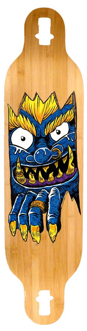
This is a new art for a Vault classic, the 42" Drop Carve longboard. The client felt the deck needed a bit of a facelift despite being a really popular board.
I was inspired by the crazy cultists and their weapons in Mike Mignola's BPRD, and especially Guy Davis' designs. I deliberately didn't go back and look at their work when I had this idea though, as I didn't want their styles to influence this piece, I just wanted the ideas I guess.
Tuesday, November 1, 2011
Werewolf update

Here is the finished image of the werewolf I mentioned in my previous post. Haven't had confirmation on whether the client is happy yet, but I sure am.
I originally tried to colour the drawing using watercolours but failed miserably - I guess I am a bit out of practice. This is coloured using the computer.
Saturday, October 29, 2011
Werewolf!

Big thanks to Kim for the job!
Friday, October 28, 2011
Quaker City Nighthawks

Sunday, September 25, 2011

Sunday, September 4, 2011

Monday, August 29, 2011

Thursday, August 25, 2011

For Nelika - Bertram the Chrononaut

Inspired by a visit to an awesome little shop in Thornbury called "The Manufactory". They sell all sorts of fun stuff, including some hand-made steampunk goggles, headphones, aviator caps etc. Needless to say, we immediately began a lay-buy account.
Sunday, August 14, 2011
Hemley Skateboarding Co.
Hemley Skateboarding Co. is an awesome skate shop on Brunswick St in Fitzroy. These logo concepts are just pitches at this stage - no guarantees they will be used. Fingers crossed.
Saturday, July 23, 2011
Misc. items from this week


The comic is inspired by a BBC production of Jane Austen's Mansfield Park, and also by Grointhief's recent rampant comicking.
Enjoy!
Sunday, June 26, 2011

New skateboard design - Athena

The owl is a great symbol of wisdom. Being nocturnal, and being able to swivel their head backwards, they see what we can't.
Wednesday, May 4, 2011
Great Destiny Man – Coloured

This is the latest design I've had approved for the Psycho label on Vault Skateboards.
It is 12 spot colours! Sheesh! This is my favourite so far, can't wait to see it printed!
As with other recent designs the original drawing was done at full size with a brush pen and scanned, converted to a vector file and coloured digitally.
Wednesday, April 13, 2011
Samurai final art

This is the final coloured version of the Samurai deck. I put up a sketch for this a little while ago. You have to imagine it bleeding off on all the edges. The trucks will sit above the little golden head decoration, and between the sword and the neck guard.
P.S. I am most happy with the sword guard detail.
Update to the Oni deck design

The red skin and white hair is more like a traditional oni (or tengu maybe?) but the client might not like the colours being similar to those used in the previous Samurai design. It makes sense though, because the face mask on the samurai armour is supposed to look like the face of an oni.
Anyway, the board this is being printed on hasn't even been manufactured yet, so it will be a while before you see this horrible visage on the streets. Looking forward to getting my greasy hands on the finished versions of the first series I did – the client has promised me physical samples of each deck! I will have to man up and get some trucks and wheels etc. and try one of the really intimidating longboards.


Monday, April 11, 2011
Yorick the Space Ape

Yorick was the first creature to ever survive a trip into outer space. He was escorted by eleven mice, launched from a base in New Mexico, and flew to a height of more than 50 miles.
Wednesday, April 6, 2011
Oni skateboard WIP

I've just finished the first capsule of ink for my brush pen, only three left! I will experiment with refilling the empty one with india ink.
Monday, April 4, 2011
Great Destiny Man

An old favourite returns. Great Destiny Man is an wandering ronin from Edo-period Japan, much like Itto Ogami from Lone Wolf and Cub, but where Itto is noble and tragic, GDM is basically just wrong. Seriously insane, his skewed take on bushido leads him to enter violent encounters with everyone he meets.
Great Destiny Man's adventures have been recorded for posterity here.
Wednesday, March 23, 2011

Tuesday, March 22, 2011
Samurai Pen
 I got a cool new brush pen from Jetpens in the mail this week. It is a Pentel Pocket Brush Pen as recommended by the inaccurately named Pants On Pete.
 The colours are done with Faber Castel PITT markers. The detail at the bottom of the image is supposed to show gloved hands drawing a sword.
Wednesday, March 16, 2011
Another new skateboard design for Psycho
 Design for the freakish 46" Asylum Longboard for the Psycho label.
 A couple of notes on all of these recent designs:
- They were all done at full size to achieve maximum detail. The original drawing for this design is 1168mm tall. It is being printed in six colours.
- They were hand drawn with pencil and permanent markers (with the exception of the Squid, which was inked with a brush) and then scanned and coloured on a computer.
Tuesday, March 15, 2011
Another deck design for Vault Skateboards

This graphic is appearing on the epic 41" Dropdown board. It is a freaky shape which is why the design doesn't go all the way to the ends (see below).

THe final inking was done with a brush and India Ink.


Sunday, February 27, 2011

Thursday, February 24, 2011
Splash image for Lost Lemuria comic
 I finally bought a really fine brush and have been practicing inking in the professional style using a pot of India Ink (courtesy of Grointhief!). This is my first attempt. The greys are done with watercolours.
Wednesday, February 23, 2011

Tuesday, February 22, 2011
Fantastic Interview with Guillermo del Toro
Seen at the New Yorker website.
Contents include del Toro's awesome mansion filled with horror movie props and related artwork, sad musings on The Hobbit movies as he was planning to do them, and exciting ramblings about the forthcoming At the Mountains of Madness movie.
One exciting note (to me at least) is that one of my favourite comic book artists, Guy Davis (BPRD, The Marquis) is involved in the concepts for the creatures in this film.
Monday, February 21, 2011
Possible replacement for middle panel on page 3 of Lost Lemuria comic


Some things that aren't evident in the black and white draft:
The floor is going to be a big union jack.
Behind Mr Fort is the London skyline - very rough and blurry at the moment.
Hopefully it is apparent that we are looking at the back of someone sitting in a chair addressing Mr Fort.
Thanks to Chris for his input!
EDITED to include the newly coloured panel and the adjusted page. I'm pretty happy with it so long as you avoid the glaring inconsistency. I hope there's only one glaring inconsistency anyway!
Sunday, February 20, 2011
All Time great comic book sequences

One of my favourite sequences in a comic, and one that I think is remarkable for a couple of reasons, comes from BPRD: Plague of Frogs #5. It is a creepy sequence of Abe Sapien (the mysterious fish-man who first appeared in Hellboy, and who is now a major character in the spin-off BPRD comics) having a near-death experience and getting a glimpse of his own strange past as a scientist/conspirator/Victorian dude.
The most obvious thing about this lengthy sequence (a couple of panels of which I have presented above entirely without permission) is that it has almost no dialogue.
The big panels and limited palette of sympathetic colours give a dreamy quality to the whole thing, and it goes for several pages, showing Abe, or Abe's astral form perhaps, floating amongst Cyclopean ruins which are straight out of Lovecraft.
The art is by Guy Davis, whose work I initially didn't like but now absolutely love. Anyway, it is a fine piece of art I read and re-read and you might like it too.
Comic Page 3

Looking at these last three posts together, it seems to me that they are getting progressively worse (not that I'm not generally happy with them all).
In trying to analyse why the first page posted works better than these others, I've noticed how striking the really large panel is. I do like the close-ups on this third page, but the wide middle panels on both this and the 2nd page bug me. Both panels try to show a room and have a lot of things to see in them – perhaps they would work better to show off important, single items? The abundant space should impart importance to the contents of the panel. At least that's what all that stuff about white space in graphic design suggests.
I also wonder if the scraps of Fort's diary that serve as indicators of time and place in the first panels wouldn't work better condensed into one in the first panel alone. It seems weird having the second panel saying they are at Crystal Palace when the first panel is of Crystal Palace.

Monday, February 14, 2011

Sunday, February 13, 2011
Yet another explorer of Lost Lemuria
 Not completely convinced by the colours, particularly the stone hand, but pretty happy with the guy's seedy expression and the animals, and his Greg Broadmore inspired weapon.
Thursday, February 10, 2011
Tattoo design coloured
 A design I did a few weeks ago in pen and pencil and only just got around to colouring with watercolours last night. This image has been touched up a little in Photoshop, mostly just increased saturation.
 The pencil and paintbrush motif is just a reflection of my love of the "tools of the trade" (although I really prefer a mechanical pencil). The skull, roses and squid tentacles are just for coolness though.
Wednesday, February 9, 2011
Lemurian Mushroom Forest
 A HerMES (Her Majesty's Esoteric Society) agent investigates an unnatural profusion of fungal growth with extreme prejudice.
 Lemuria, 1900 AD.
Tuesday, February 8, 2011

Sunday, February 6, 2011
Even more Lost Lemuria!


 I got some watercolours on Friday and experimented with them over the weekend. I think the bottom image of Charles Fort works the best, probably due to the limited colour palette.
I also like the blue stone relic Marie Curie is resting on, and some of the plants in the foreground in the picture of the explorer facing an ominous stone doorway.
Subscribe to:
Posts (Atom)